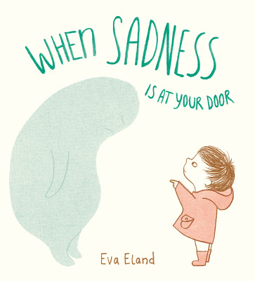
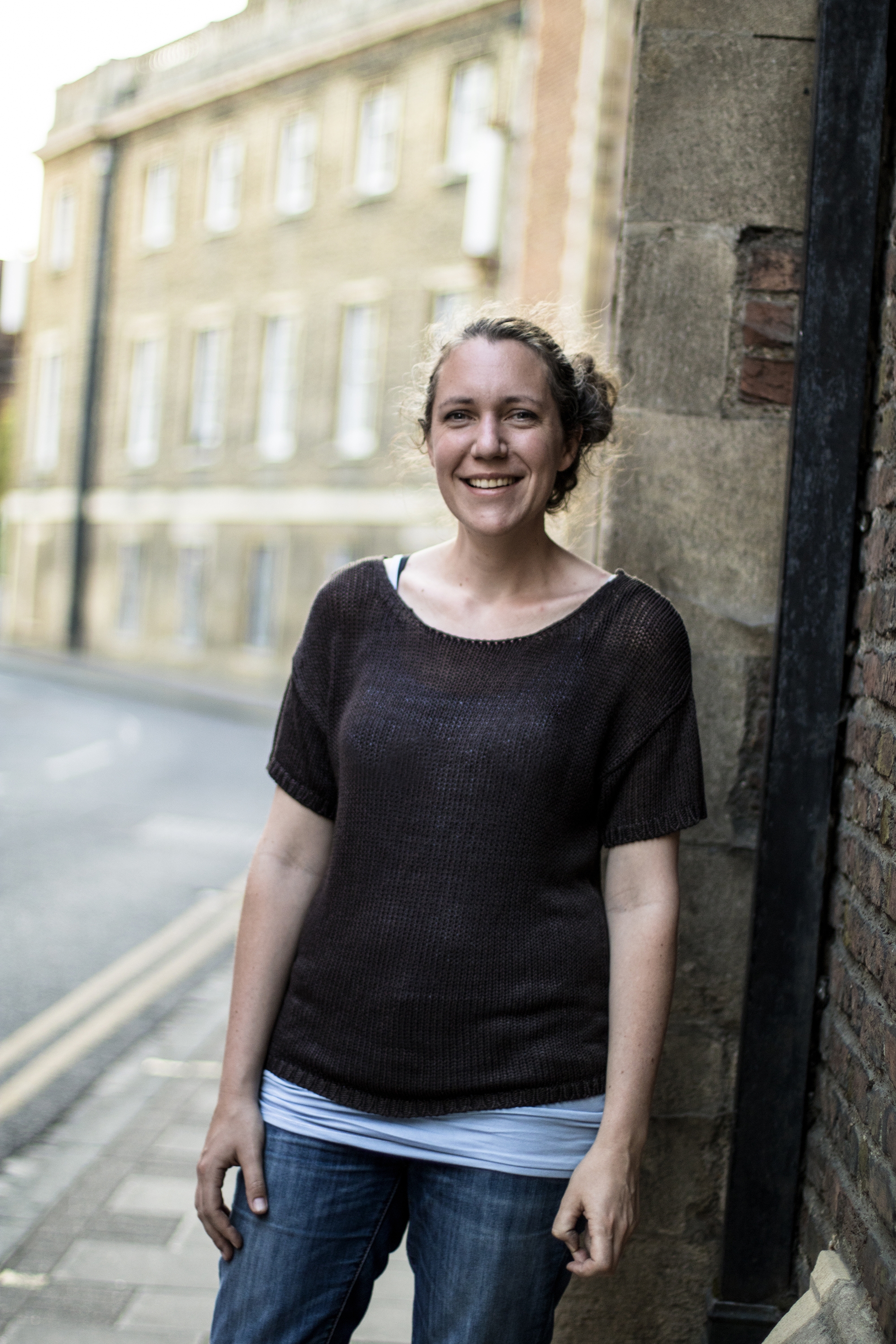
Happy Book Birthday to Eva Eland & When Sadness is At Your Door!

A comforting primer in emotional literacy and mindfulness that suggests we approach the feeling of sadness as if it is our guest.Sadness can be scary and confusing at any age! When we feel sad, especially for long periods of time, it can seem as if the sadness is a part of who we are–an overwhelming, invisible, and scary sensation.In When Sadness Is at Your Door, Eva Eland brilliantly approaches this feeling as if it is a visitor. She gives it a shape and a face, and encourages the reader to give it a name, all of which helps to demystify it and distinguish it from ourselves. She suggests activities to do with it, like sitting quietly, drawing, and going outside for a walk. The beauty of this approach is in the respect the book has for the feeling, and the absence of a narrative that encourages the reader to “get over” it or indicates that it’s “bad,” both of which are anxiety-producing notions.Simple illustrations that recall the classic style of Crockett Johnson (Harold and the Purple Crayon) invite readers to add their own impressions.Eva Eland’s debut picture book is a great primer in mindfulness and emotional literacy, perfect for kids navigating these new feelings–and for adult readers tackling the feelings themselves!

What inspired you to write this book about this topic right now?
Actually, I wanted to make a comforting picture book and wanted to understand more about image making that could achieve this. But I soon realised, that to make something comforting, I needed to understand the ‘difficult emotions’ better first, so I started to explore sadness, fear and anger as characters. Sadness was the one that I most resonated with myself, as it’s a feeling that has frequently visited me since childhood, and a feeling that has become very familiar, almost like an old friend.
My students are always interested in the behind-the-scenes process. How long did it take from the time you started drafting the book to finishing it to be ready for publication?
Short version: I only worked on the book for about 2,5 months with Andersen Press (which is not a long time), but before we started working together on it I had already developed the book over the course of 1,5 years, but alongside many other projects and with many intervals, as I was studying the Children’s Book Illustration masters at the Cambridge School of Art at the time.
Longwinded version: With this book it’s a bit difficult to tell, because I had the original idea it’s loosely based upon in 2012. In 2016, during my studies at the Children’s Book Illustration masters at the Cambridge School of Art, I revisited this idea, but I initially focused on a completely different story, also about sadness. Early 2017, I decided to rework the first idea and make it into a picture book that I could present at the International Children’s Book Fair in Bologna, at the stand of the Cambridge School of Art. It’s there that Andersen Press found my book and approached me. We started working on it together in the summer of 2017. It was changing till the very end, as we had to tell the same story in fewer pages. It really became so much better because of this focus and we took great care in making sure the message was just right. We finished it in a relatively short time, for the final artwork I think I only had 3 to 4 weeks. It was only possible to finish it in a relatively short time because of all the work and experimenting I had done before that time already.
How/Why did you decide on the limited colors/illustration style for this book?
At the time I was developing this book, I was also experimenting with printmaking techniques, in particular risography, the method of printmaking I also used for illustrations in the book. I also experimented with just how far I could pare back my work, for it still to be effective and communicate. Working with a limited colour palette seemed to be a natural fit for this book. The subdued colours fit the subject, and I think with a topic like sadness, it is important to leave as much space for the imagination of the reader, to allow for their own interpretation. So however big, small or personal your sadness might be, you can still relate to the words and images in the book.
Did you try any other ways of depicting sadness before landing on this final version?
Funnily enough, the shape of this sadness, was there from the beginning. I did however experiment in between with lots of different ways of depicting sadness (abstract shapes, elephants and hairy creatures all past the revenue), but I decided that the sadness character you can find in the book now was the most effective one after all. It was important that the character wasn’t too specific but also that it had an endearing element to it, so children can relate to it and wouldn’t feel threatened by it. The halftone texture of sadness has been quite a long journey however to find. I was very sure from the beginning it shouldn’t have a solid outline and it should be semi-transparent – but sometimes it can still take a while to get it right.
What do you hope kids (& adults) take away from reading this book?
On the one hand I like it that the book seems to have a reassuring and comforting element to it, but what I like most is that it has the potential to show kids (and adults just alike) that it’s not necessary to be afraid of our emotions. We can learn to understand them better and take care of them, and as a result we will understand ourselves and others better. This is a continuous journey, but reading a book like this can be a great conversation starter between kids and adults, to explore the subject further – and as a result we might be able to feel more kindness and compassion towards feelings like sadness, ourselves and others.
What’s next for you?
Making more books! I’m finishing my second book with Andersen Press at the moment, which will be coming out in spring 2020 if all goes well – and I have lots of new ideas for books that I will soon start to develop further. I can’t really share more I’m afraid.
Thank you to Random House for coordinating and providing an F&G of When Sadness is At Your Door to preview.


